


Something similar might happen on your website or e-shop if you do not organize the content in the way your target users expect to find it. The way content is organized is called “information architecture” and it’s especially important in case of complex websites like e-shops, media, governmental portals and even corporate presentations.
So what’s information architecture?
The scientific definition is that IA is a set of methods that try to organize, structure and label the content of your website. The goal is to create a navigation that is so intuitive and clear, that every user will be able to find what he is looking for as fast as possible (avoiding low conversion and high bounce); and discover new things (increasing upsell).
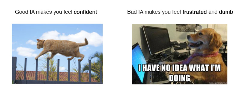
The less scientific definition is, well... described by this cat and dog:
The consequences of bad IA can go much further though. For example, in case of the e-shop Asbis.sk, we run the navigation through a Treejack testing just to find out that 89% of customers looking for smartphones were getting lost (many of them potentially ending up at the competitors e-shops). No one, not even client, had any clue that this is happening.
How can you determine if you have problems with your information architecture?
So at this point you might be asking if there is any quick way of evaluating the IA of your website. And indeed, there are couple of ways that we use at the beginning of new projects to determine how much work will be needed to redesign the IA.
1. Lack of user involvement
Your first red flag should be if you answer this simple question negatively: “Have you involved any users when you were creating your IA?”. Remember, knowing your users and understanding their mental models are two very different things. Don't fall into the false believe that you know your users so well you don't need talk with them. Research is essential.
2. Heavy usage of search bar
There are websites that focus on a search-based navigation and provide powerful ways for users to search, but there are other websites that are catalog-based. Whatever the case, if analytics shows that your users first accessed catalogue, and then used the search bar, they probably had troubles. The same applies if your users first tried to search and then switched to catalogue. Search might not be returning relevant data or your content is not properly indexed.
3. Bad analytics
Try to look in your analytic tool for high abandonment rate on transfer pages (pages that only serves for navigation, like homepage, catalogue, categories, etc.). Important content pages with low visits might also suggest that users are not able to find their way over there.
4. Tree testing
This is the most bulletproof way, as you will be testing your IA with real users. You will ask participants to complete a set of tasks using your information architecture. Displaying cards from top to bottom, you will reveal sub-categories as the participants decide which way to go. Their goal is to decide which card has the most relevant piece of information related to the task they were asked to perform. Tree testing uses a very simple interface to determine whether your structure is functional regardless of visual clues, navigation aids and external factors. A great tool for this is Treejack.

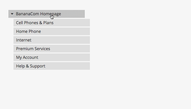
Tree testing via Treejack
5. Usability testing
Conducting a usability testing just for the purpose of validating the IA is probably quite an overkill. However, if you are already running regular usability tests anyway (and you should!), you might pay more attention to certain cues that might suggest problems with navigation.
First of all, try to use more tasks that push users to browse the navigation or catalogue. Another thing you can do is to ask users to describe the meaning of different labels in navigation and listen carefully to their comments. Users may understand certain phrases in completely different way than you think.
How to fix this?
Chances are you discovered some red flags on your website. The good news is that it’s fixable. The bad news is that there is no quick and dirty way of doing it. A way that works best for us is a method called card sorting.
Many have heard of the term, but very few actually used it. If you want to learn more about this method, we have prepared for you a free how-to guide. However, if you work with really complex websites, you do want to run a couple of first sessions with an experienced UX analyst.
